A happy little website - as bright as bright can be.
Who doesn’t love vegemite? (That's a rhetorical question).
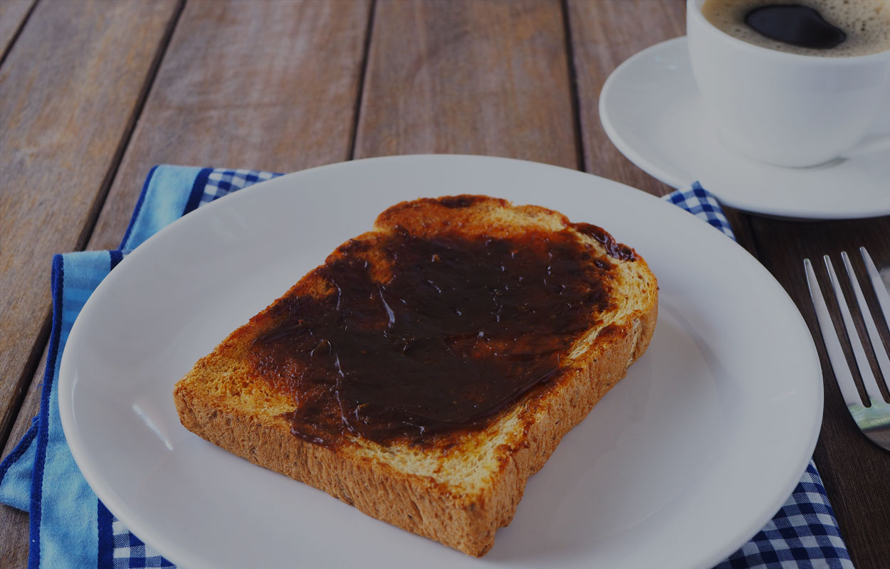
The world’s most polarising toast-topper and Australian icon is polarising; some love it, some don’t. Whichever side you’re on, there’s no denying it’s an Australian symbol we connect with.
It’s this connection we wanted to use to bring kids, parents and teachers closer to the brand when I designed the site in 2000.
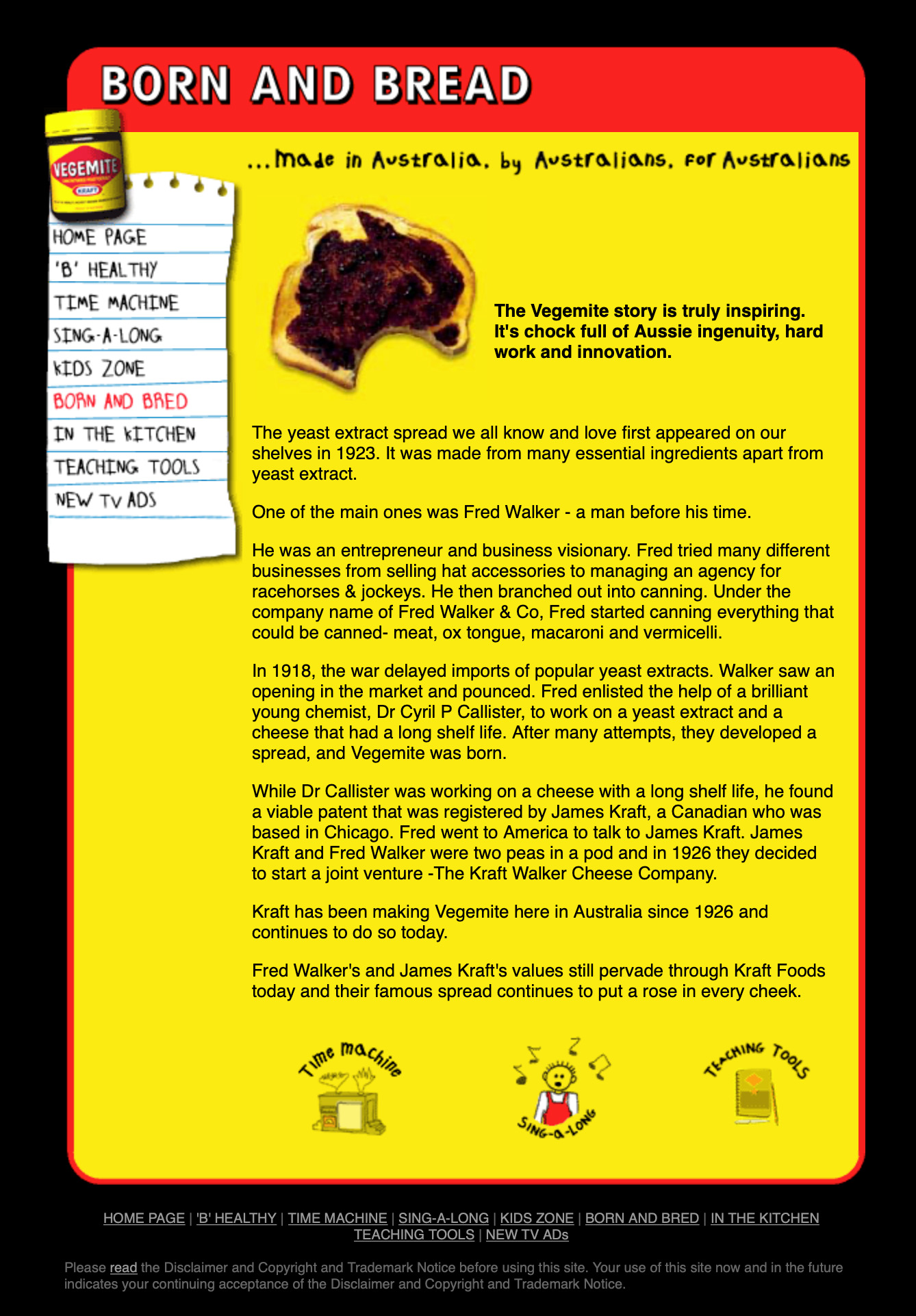
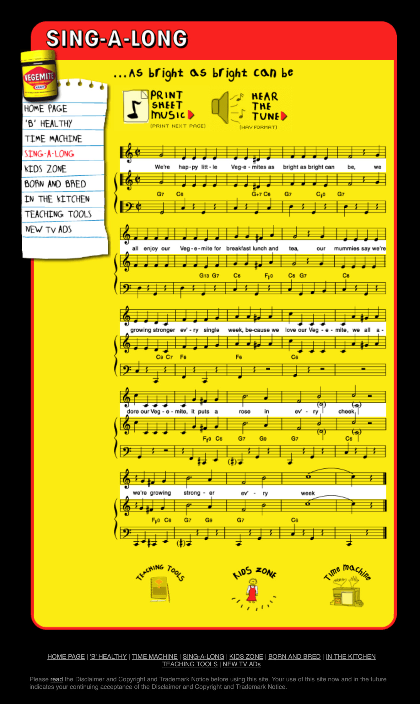
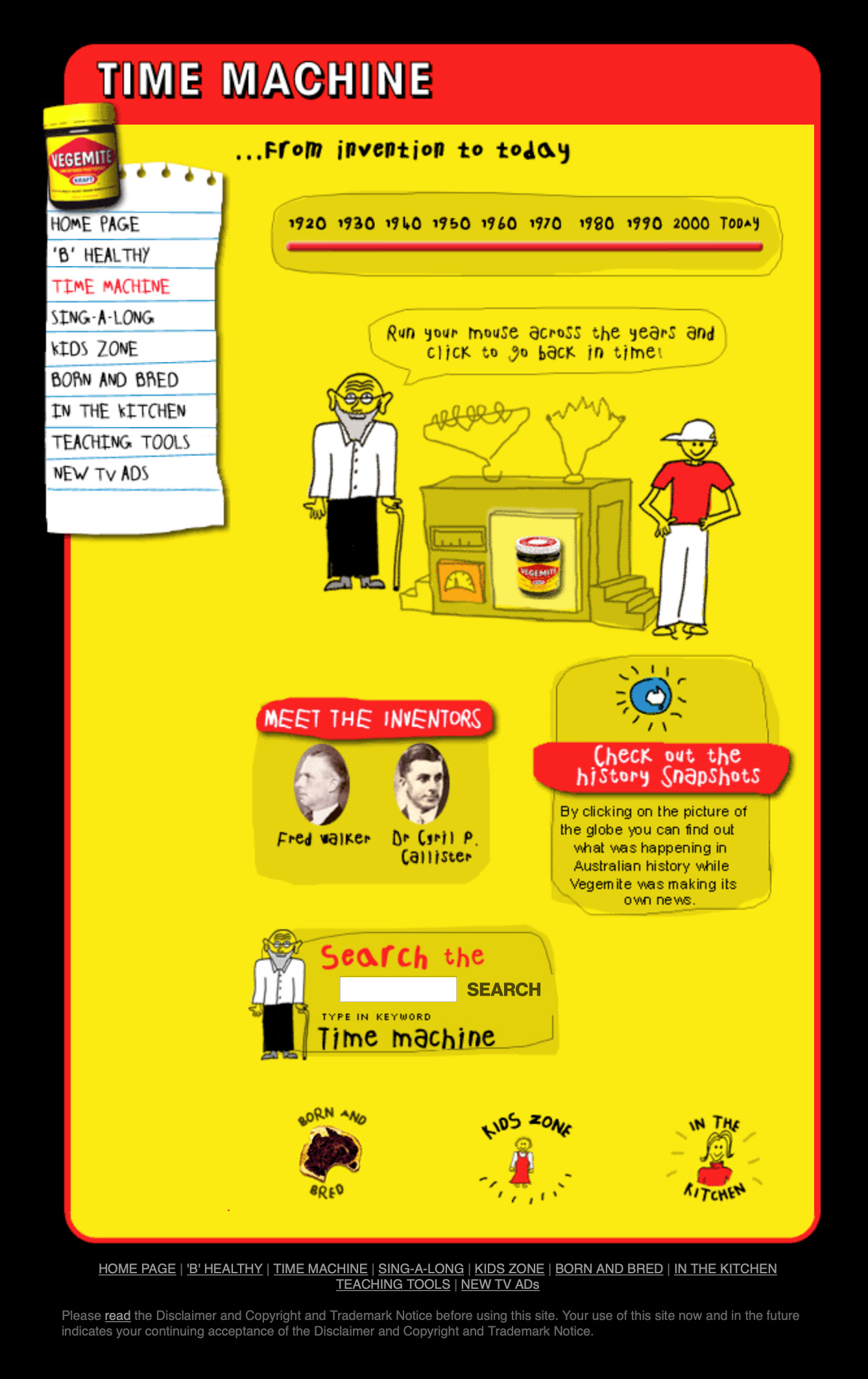
ApproachThe new site was to offer games, teaching resources and nutritional information in an easy to use format. I employed a fun, bold style, creating illustrations to accompany the few supplied by agency JWT. Animations and lively hover states brought the design to life and drew attention to other activities and content.
OutputBack then design didn’t concern itself with mobile – the issue was download speed. This design used a flat style and was relatively quick to download the recipes, history and health benefits of vegemite.
The site was a success, drawing in visitors who’d found it in newspapers, advertising press and through a JWT campaign.


