Coopers virtual bar
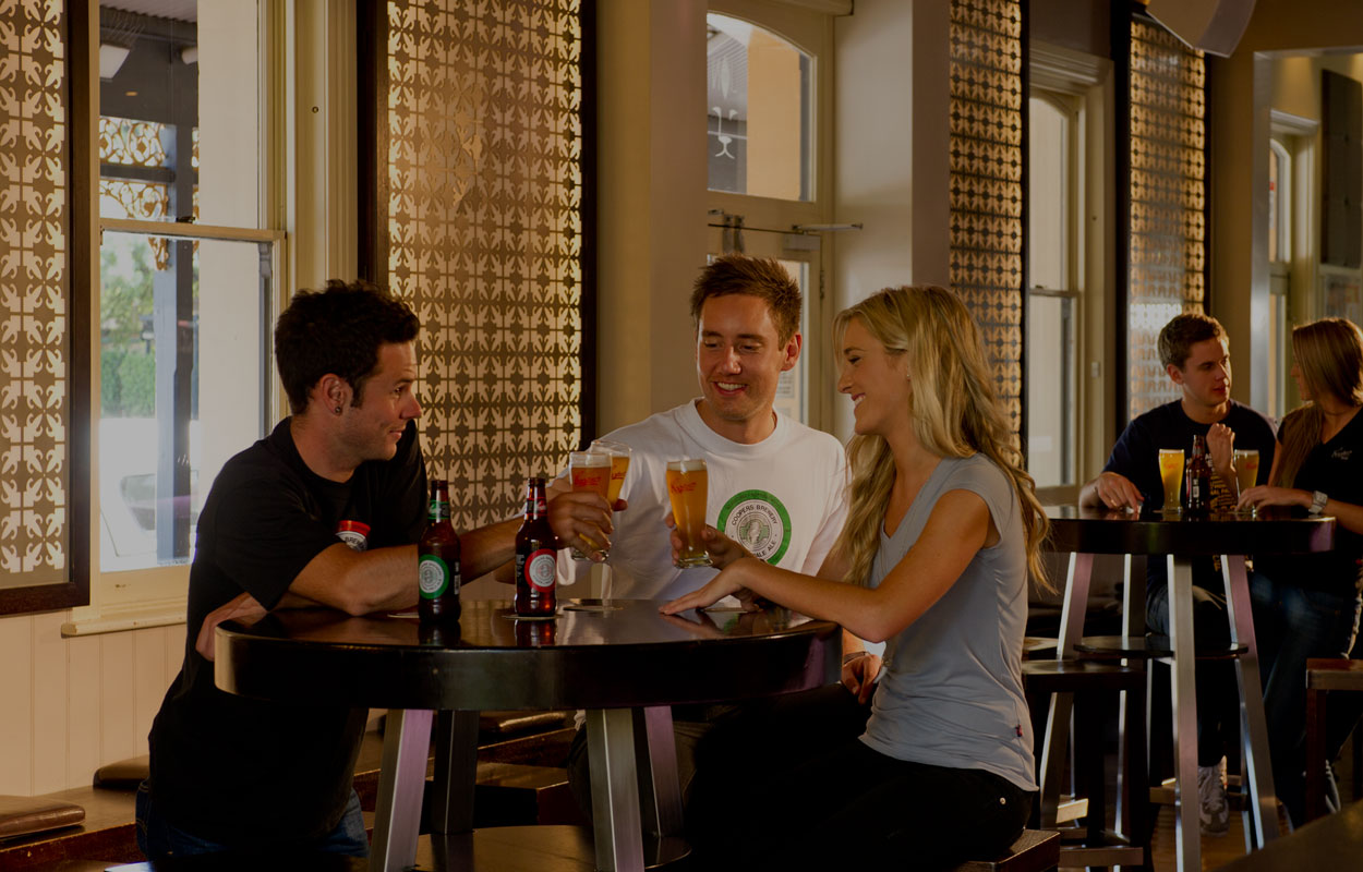
‘Sometimes you want to go, where everybody knows your name, and they’re always glad you came’. Know those lyrics? They’re from TV show Cheers and share the kind of sentiment we wanted bring to the Coopers website.
Coopers – Australia’s only independent brewer – approached Citrus to map-out, design and build their website. The work was to include a public site, a DIY brewers’ site, a member’s area, a forum, stockists and a storefront. It was quite an undertaking.
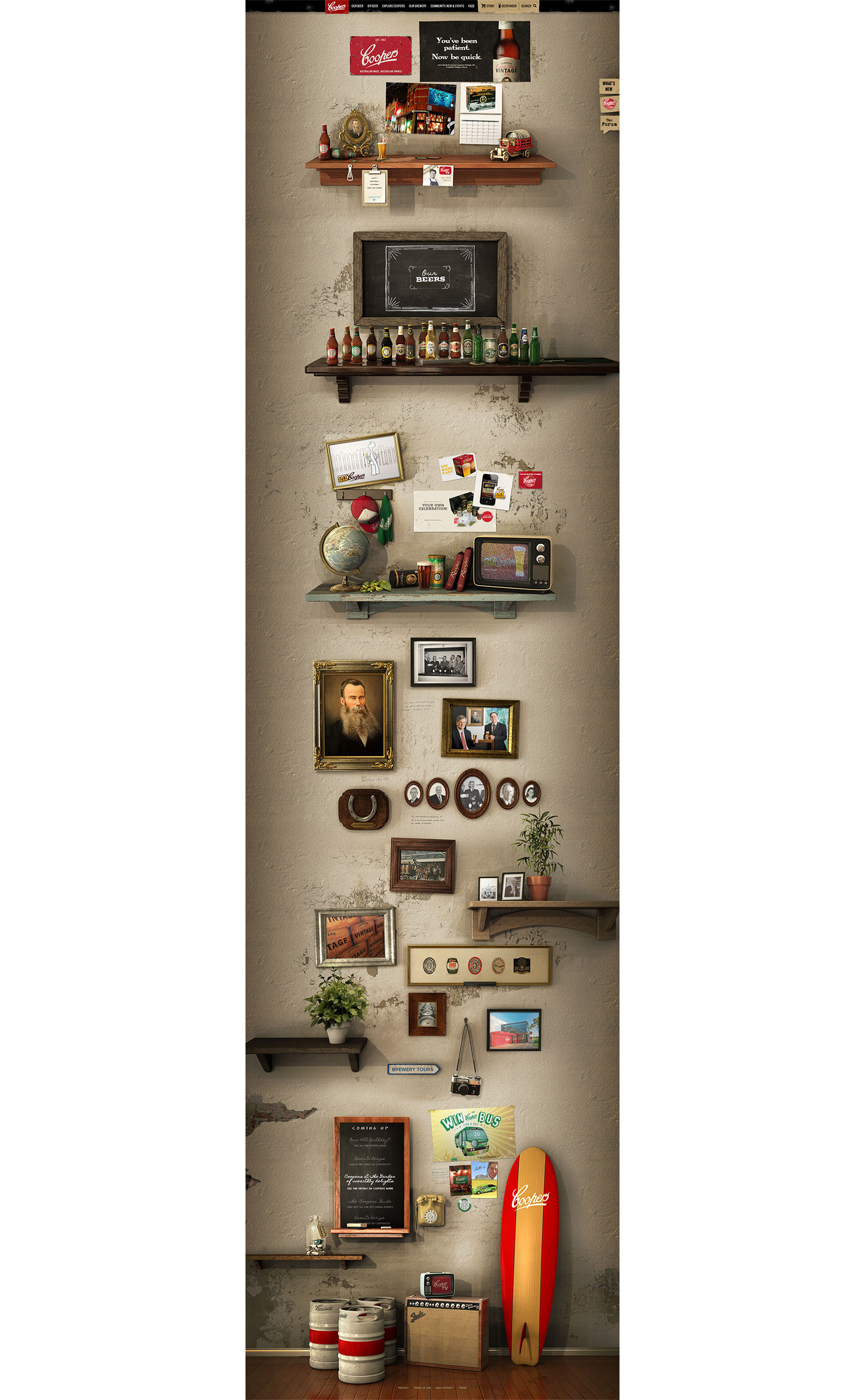
ApproachBriefed in by members of the Coopers family – we started with competitor research and launched into the scaffolding. The wireframes went through some serious evolution in the following days. An idea of making the site feel like a local bar arose. This concept soon became lodged in our conversations and survived as the favoured design approach.
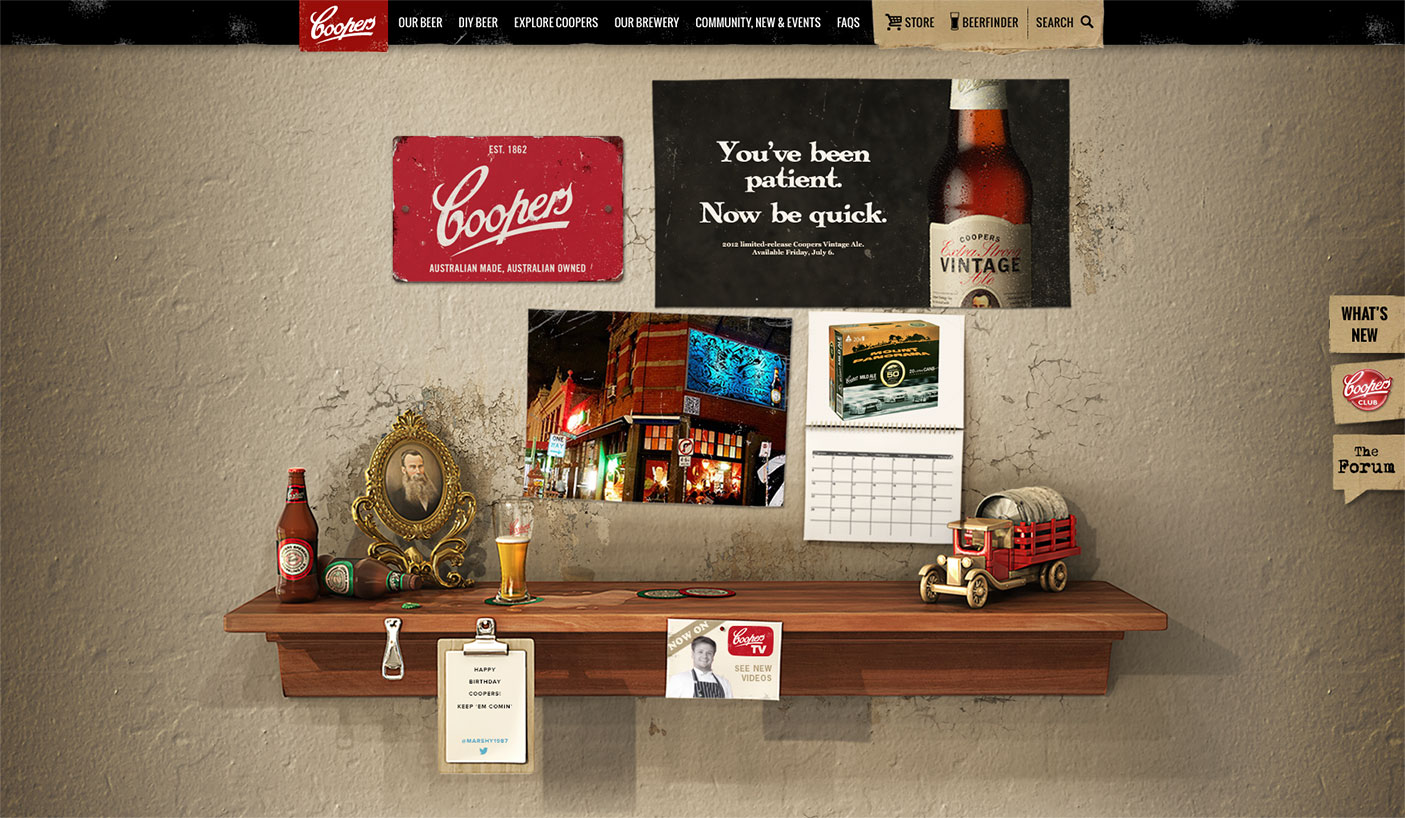
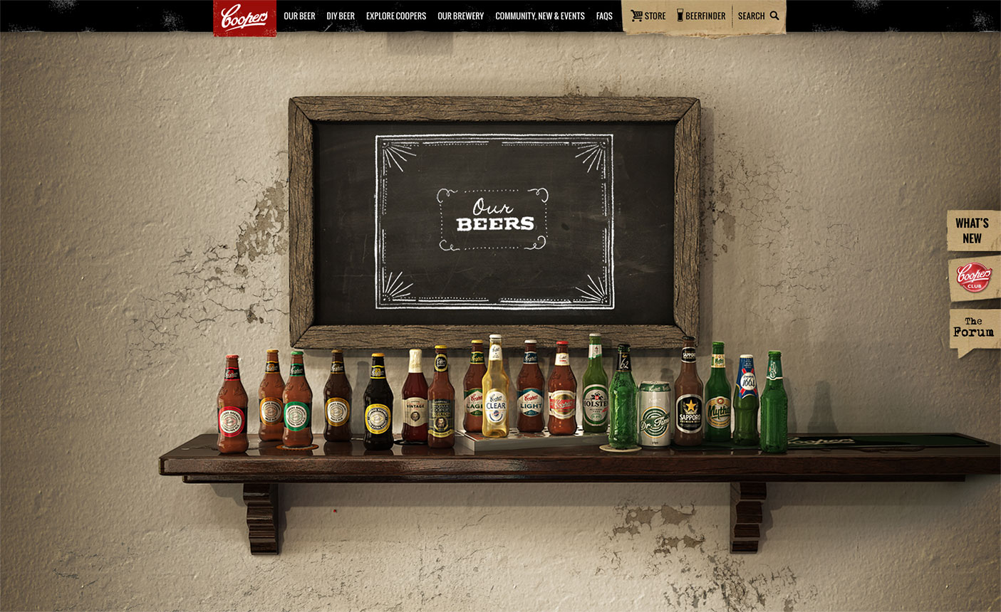
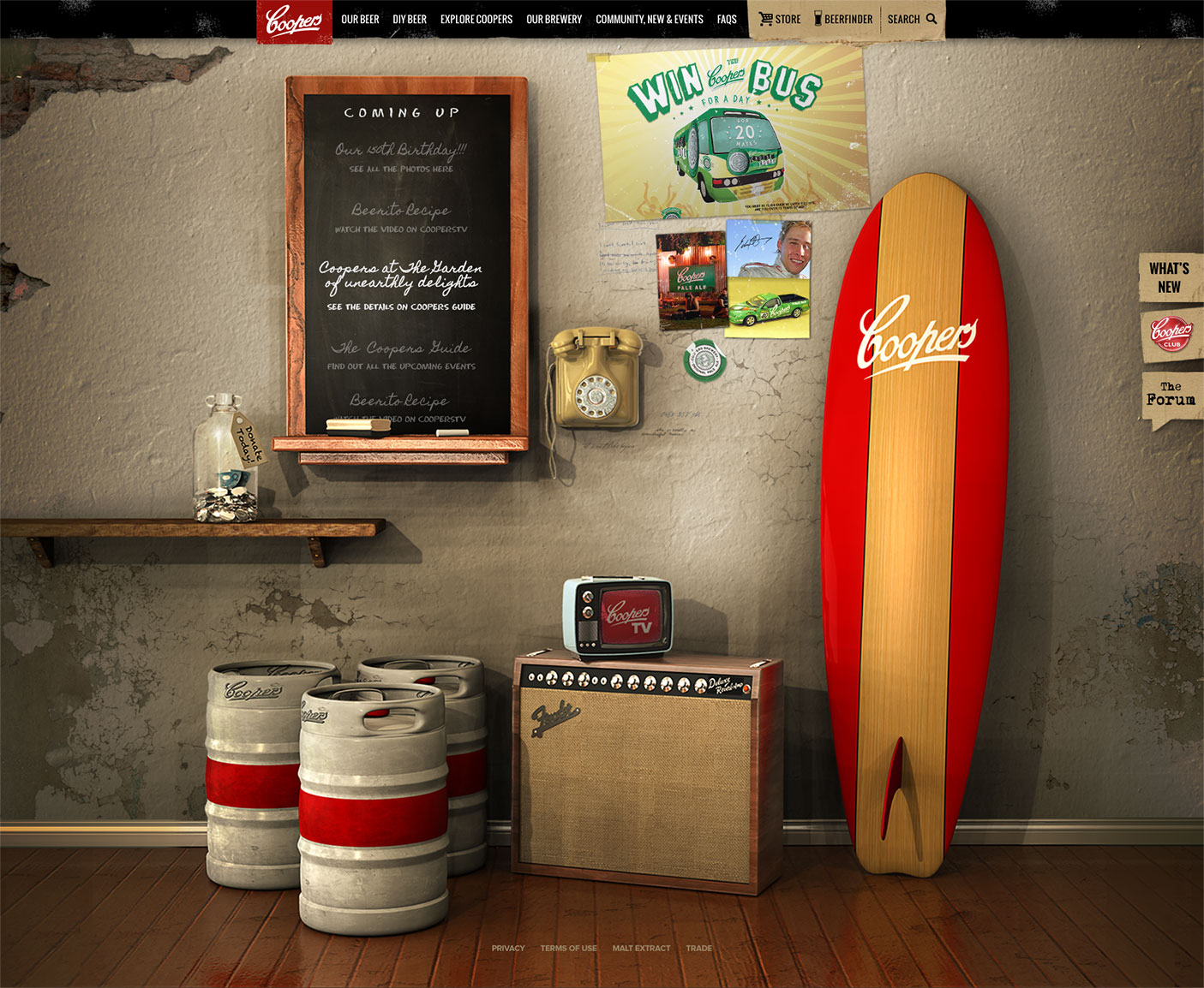
OutputWith the first step of the skeuomorphic approach I worked closely with 3D agency Imagination to direct the 3D renderings – these became the base of the Coopers ‘wall’. We introduced navigation items and descriptive hover states to ensure it was easy to use. Visitors could choose the top navigation or click objects in the scene. A gig poster will take you to the event listings, a phone will take you to the contact us page and so on.
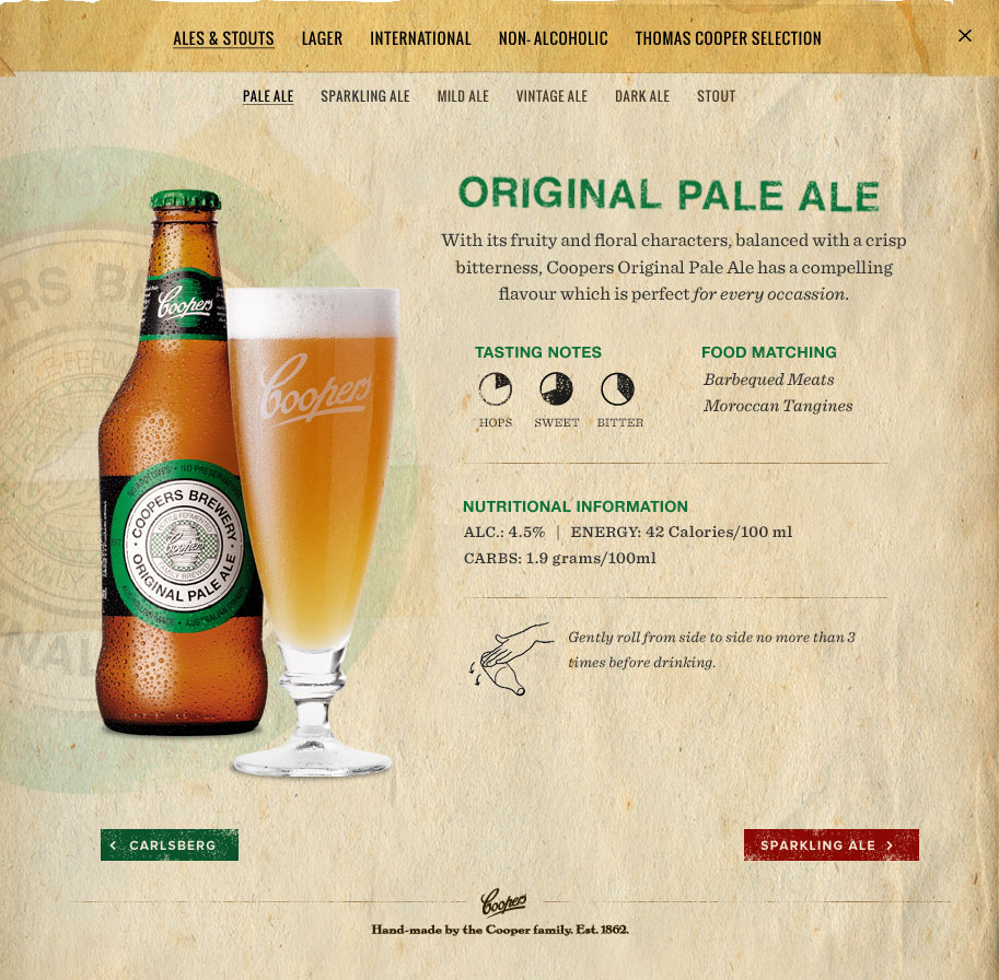
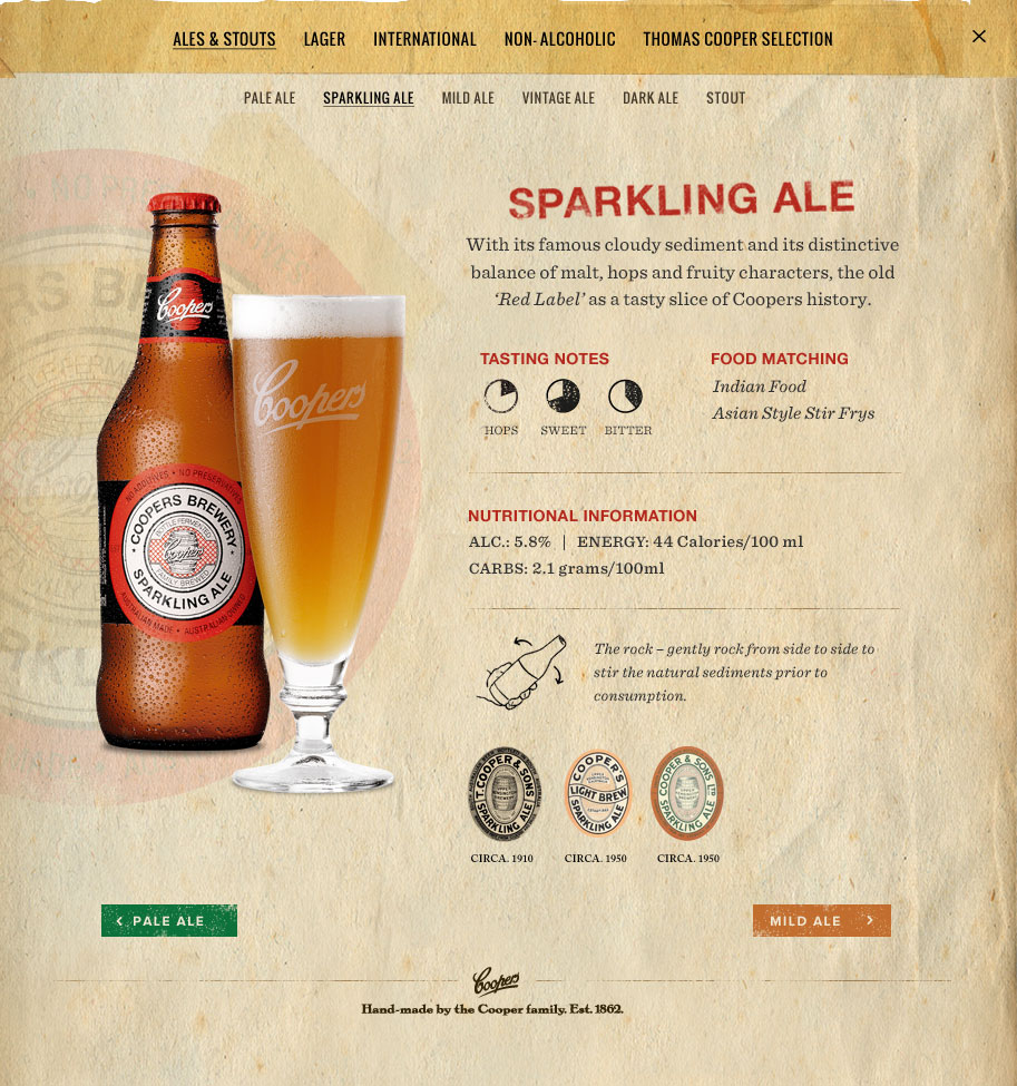
The homepage was a feast for the eyes with Easter eggs and miniscule details one might not see immediately. Journeying to other pages the visitor is greeted with more familiar layouts, still using the crafted rustic aesthetic. Weathered paper overlays with torn edges and vintage typography – it all added to the historical, well-worn character.
The Coopers Club took on a similar aesthetic while the DIY shop had a brand of its own.
A social media campaign built up the launch of the new site after which it received several awards and was featured in the press. We had built the virtual bar for Australia’s favourite home-grown beer brand.
