A forerunner to travel communities and retail fare sales
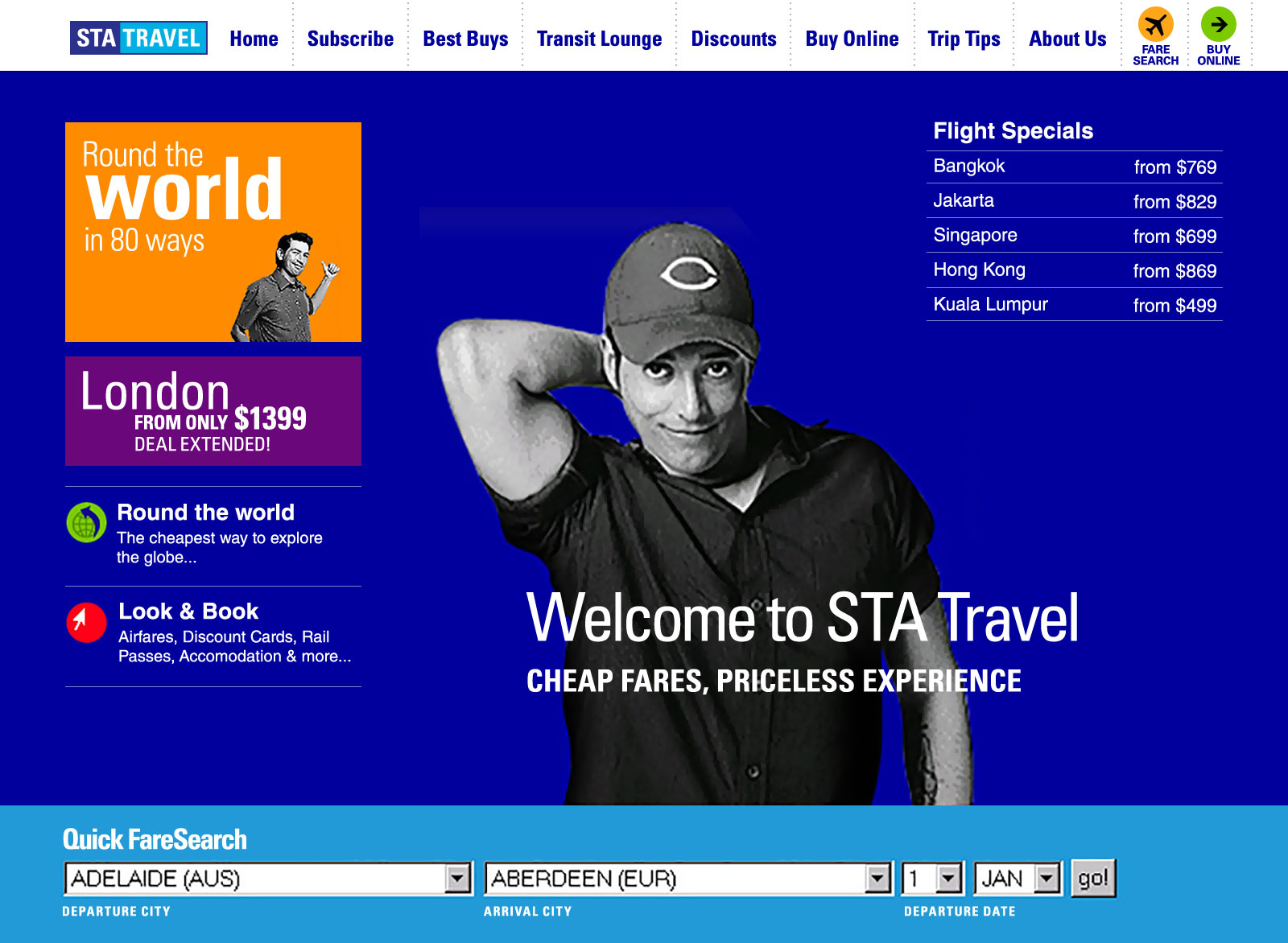
By the late 1990’s one of the few places you could buy flights online – and join fellow travellers - was on the Australian STA Travel website. They were what we’d call early adopters.
At Web Design Group (WDG), after we won the STA Travel account, I was charged with the design of the website – a task that involved a lot of moving parts.
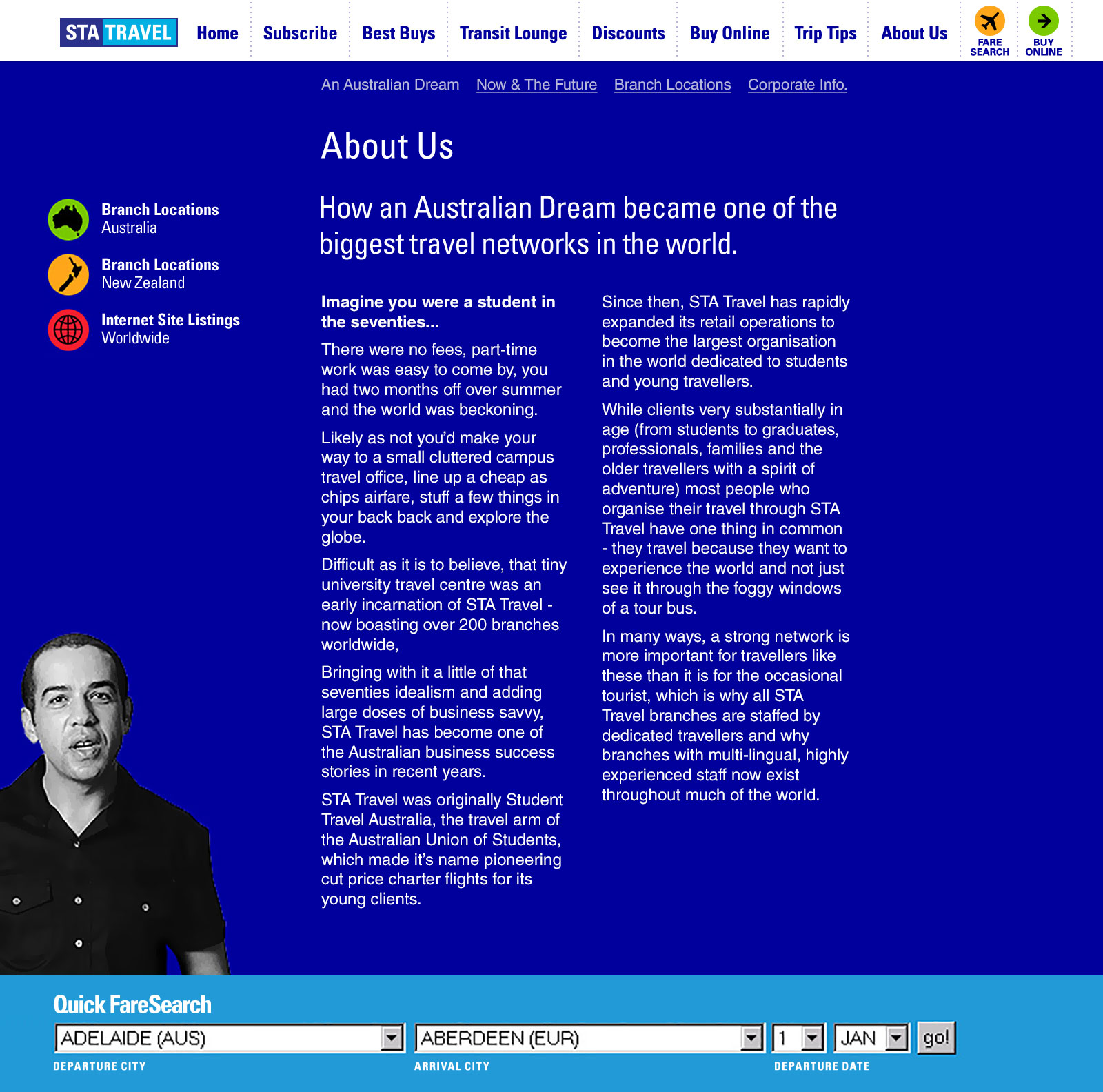
ApproachFrom the outset a digital style guide was created – we needed consistency at speed. The brand’s off-line design informed the basics; typography, colour and some iconography. The document grew to house the digital-only components too and evolved into a fully-fledged digital brand document. (Later, this inverted with some digital branding used in print artwork). The design aesthetic was applied to bespoke pages and templates as we defined the site.
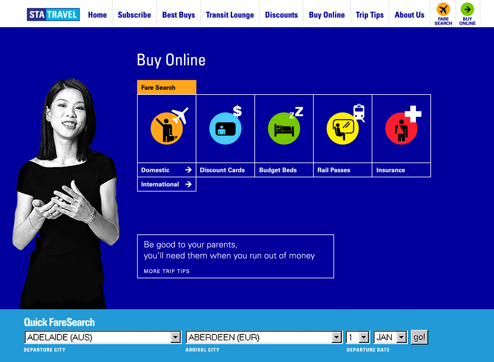
OutputSTA operate in the youth travel market; they’re helpful and worldly, energetic and a bit cheeky. As a differentiator in the travel market they brought this character to life by offering a range of online services. Buying a ticket? Get a free email address to share stories and pics (Contact). Thinking of travelling to Bangkok? Ask a fellow traveller where to go in the chat rooms (Transit Lounge). Cheap getaway with mates before Uni restarts? Browse the bargain flights (Best Buys).
All these functions – built from third-party and owned data – were seamlessly stitched into the website with consistent aesthetic and behaviour.
For four years I designed and updated the design of the STA site – it involved a logic for breadth and depth that taught me the value of flexibility and consistency in design. It also taught me to appreciate (and where possible anticipate) an audience.


