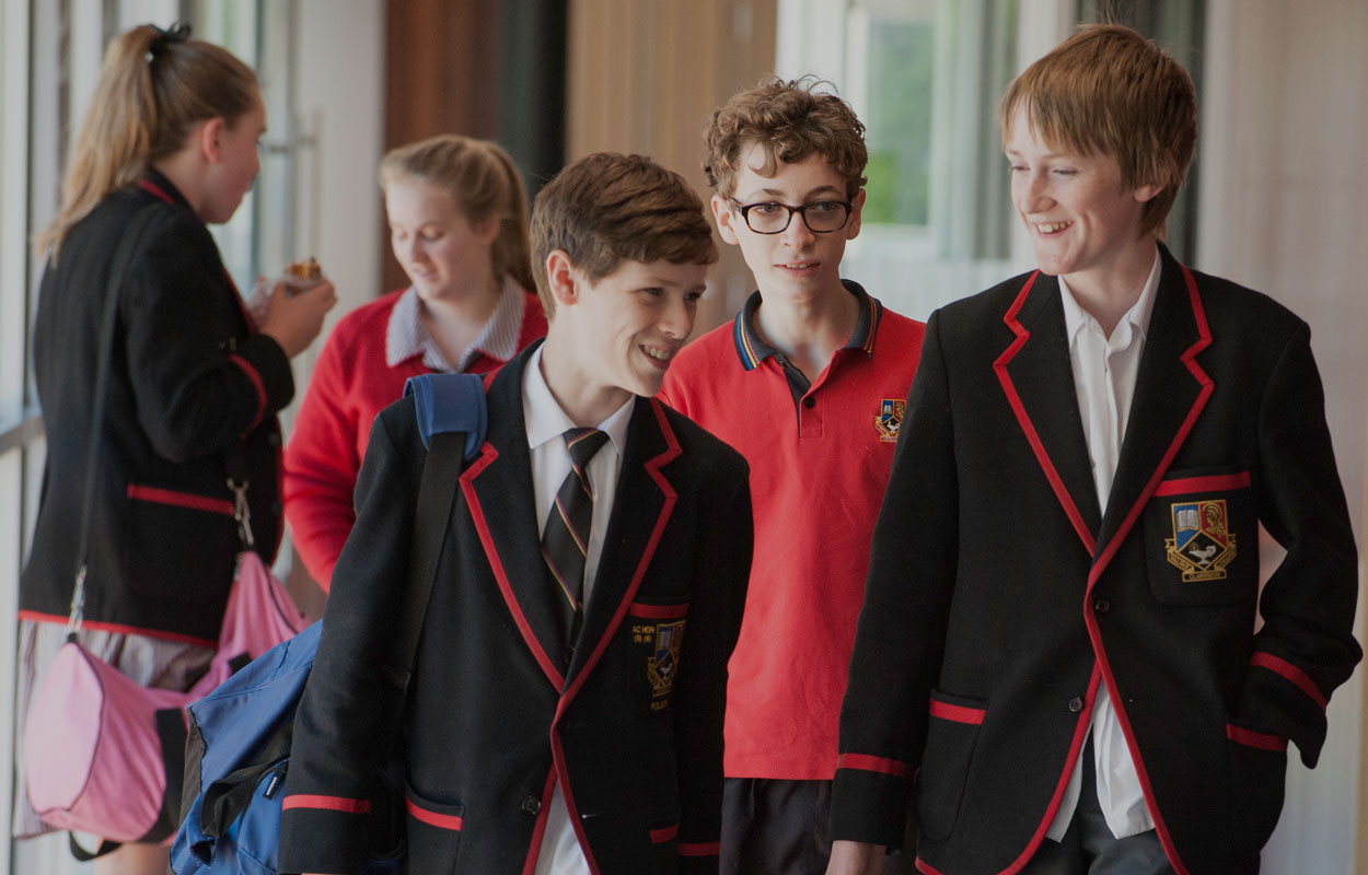
Telling the story of a school with the faces of its future
Ballarat Clarendon College (BCC) is a well-respected school with a reputation for results. It’s the top regional school in Australia.
When the opportunity arose to design their website – I was doubly excited. Firstly, to work with an organisation doing good in the community and secondly because it was a strong versatile brand. The success of any school is in its people and I was adamant about highlighting this.
ApproachBy using emotive photography, the site can draw viewers in — giving them a look at the place and its people. The content changed very little in the transition to the new site and the functional areas like Parent login, Alumni and ‘Giving’ were handled by third-party apps. The design is in many ways a showcase – offering an outline of the school, their academic approach and important information around admissions.
OutputI set out creating wireframes and gained access to a brand library, fortunately containing some great photos of students and staff. (A photographer was commissioned to capture more in the lead up to launch).
The page design is such that page text would float over the photographic background and the top nav would stay in place. There’s a strong grid inherited from the print brand which gives the foreground a rigidity while the background brings the page to life. The type treatment too draws heavily on the print material.
The site is still live today – and puts on display a proud school, one that has an impressive pedigree, terrific results (and a pretty nice website).


