Promoting good health with and good web experience
Vichealth is Victoria’s premiere health advisory group. They research, promote and fund programs all with the aim of making Victorians healthier. They help us make good decisions about our health.
In 2005 it was decided a new website was needed. The existing site made important content difficult to access, and the user flow was clunky.
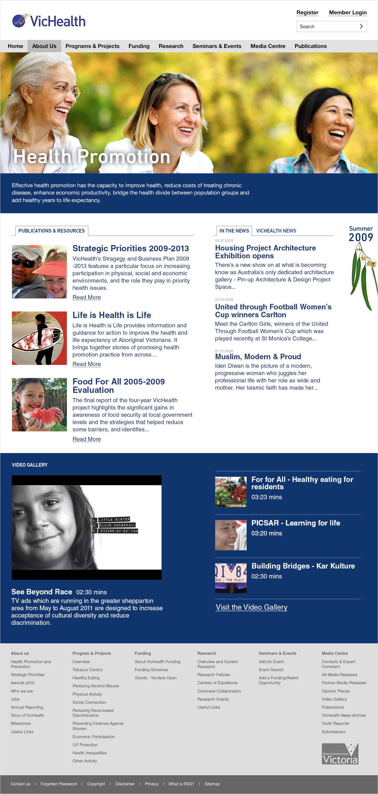
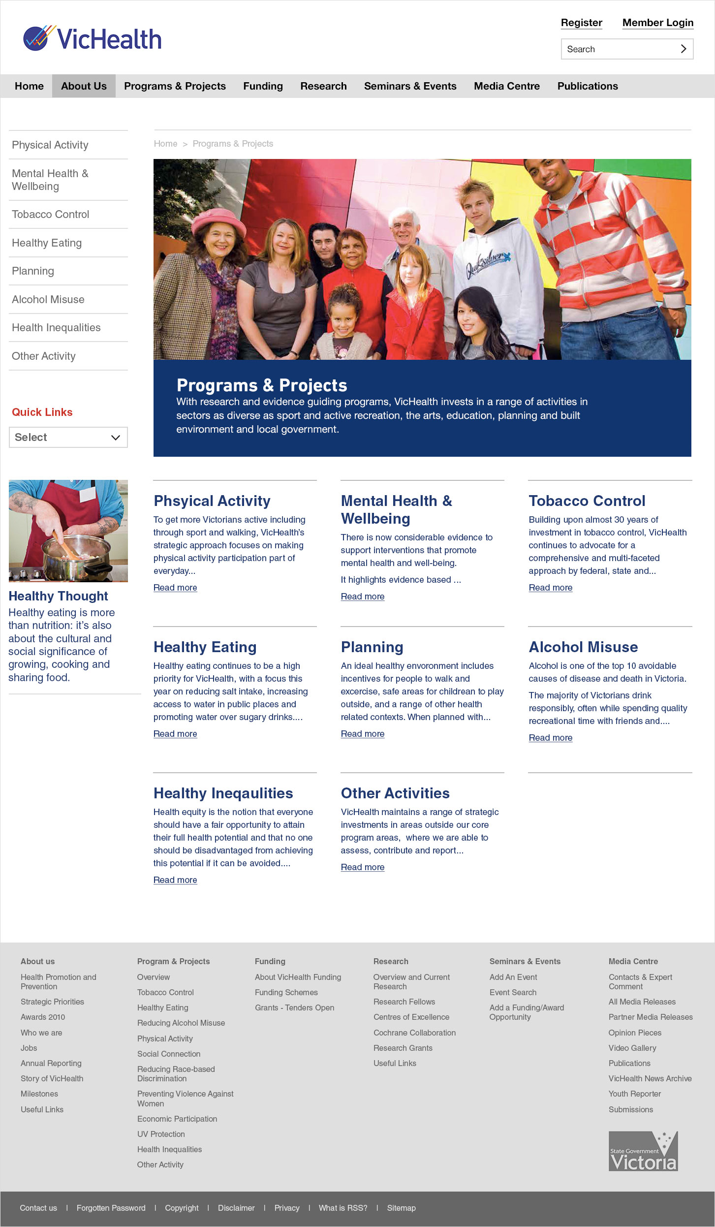
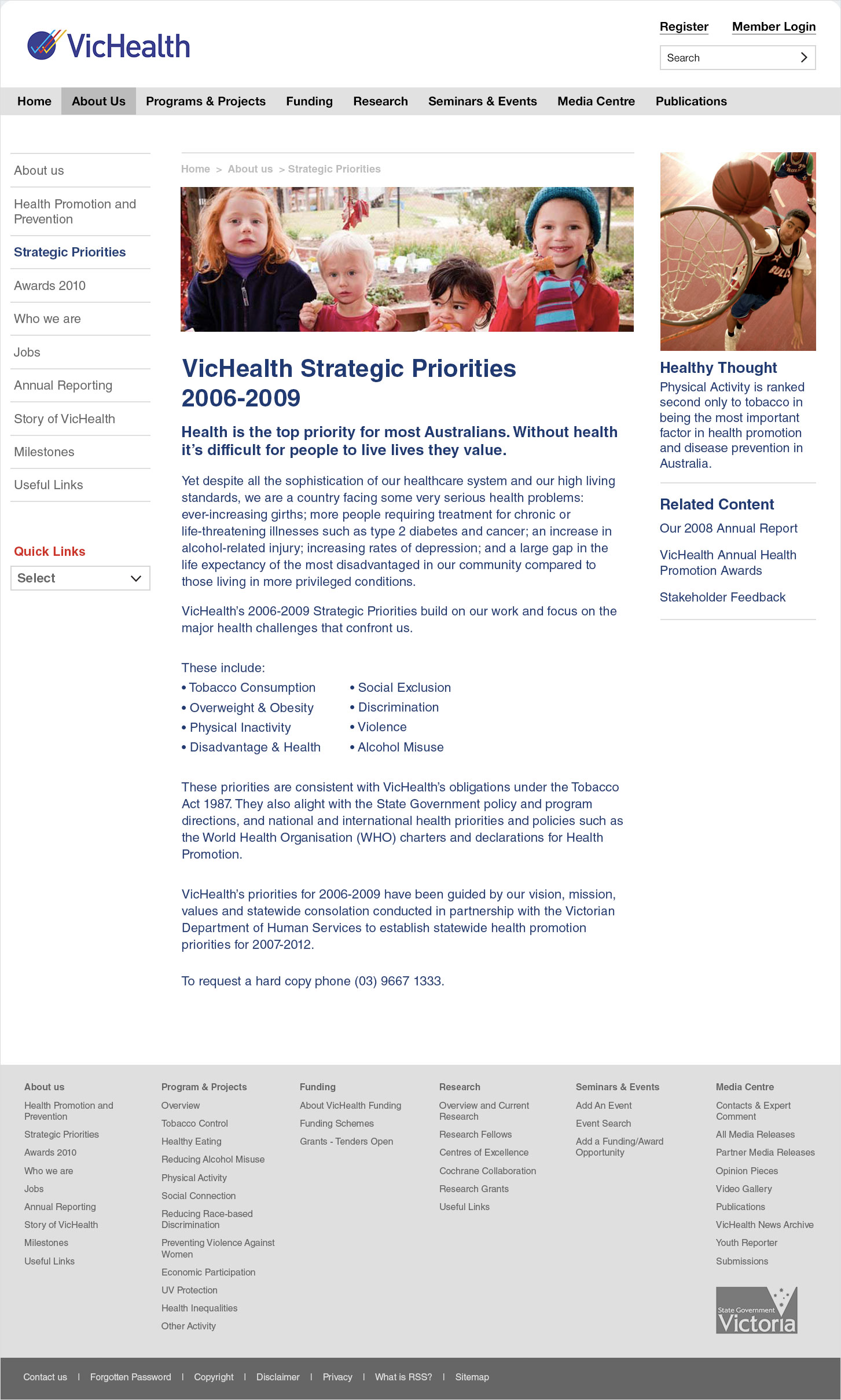
After briefing and stakeholder interviews I set out – with a business analyst – to determine the information hierarchy and architecture. The audience is varied – from academics and researchers, through to doctors and social workers. So, we adjusted the main pillar areas slightly and pulled three core focus areas to the homepage; news, research and new videos. In addition to a simple top nav, a ‘fat footer’ was used to make sections self-explanatory and content easier to browse.
With the content outline in place I began the interface design – with an aim of bringing a strong human aspect to the job. It was important to infuse the site with a genuine personality. We did this through the use of candid photography.
The design framework utilises a logical typographic hierarchy and colour coded sections. A style guide was created and applied aligning to the existing brand. With simple language and an approachable design, the site held up the content – making it accessible to all users.
This version of the VicHealth site was launched and lauded and at the time become the most visited version to date.


